‘Whimsy’ Print Attempts to Market Hate Film to Children and Animation Buffs (A ZRC Review)
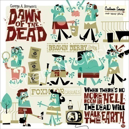
Just a quick update on non-protest matters to talk about this so-called ‘Whimsy Print’ for ‘Dawn of the Dead’, created by artist Dave Perillo:
What if George Romero’s classic Dawn of the Dead was a Disney animated film? Well, luckily you don’t have to worry about that happening, but this original illustration by cartoonist Dave Perillo has a certain vintage Disney quality to it – but with an underlying note of menace.
The only menace I see in ‘Dawn of the Dead’ is toward the poor Zombies, oppressed and segregated, shut out of the major economic activities of their hometown solely on the basis of Living Supremacy, then attacked by vicious cops, yuppies and eventually Tom Savini himself.
As for the print itself: while it certainly is interesting, transforming the image of the Romero Zombie in this fashion into classic cartoon styling, the art itself conveys harmful stereotypes about Zombies (brain shopping) while minimizing the suffering and Anti-Zombie violence from the film itself. Basically, it’s insensitive to the plight of the Differently Animated, and helping to whitewash this particular cultural milestone’s negative impact out of existence while pushing more modern, and irrelevant, Anti-Zombie prejudice itself.
For example: the brain-eating thing originates, at least in terms of widespread popularity, from ‘Return of the Living Dead’, a much later movie not made by George Romero; it is not present in ‘Dawn of the Dead’. At all.
Romero himself has stated emphatically that his ‘Zombies’ do not hunger for brains:
brains. What is it about being undead that makes somebody so ravenous?
First of all, why does everybody say that zombies eat brains?
Because… it’s true?
I’ve never had a zombie eat a brain! I don’t know where that comes from. Who says zombies eat brains?
I remember brains being a big zombie menu item in Return of the Living Dead back in the mid-80s, but I’m not sure if that’s where it started.
Whenever I sign autographs, they always ask me, “Write ‘Eat Brains’!” I don’t understand what that means. I’ve never had a zombie eat a brain. But it’s become this landmark thing.
(Romero in bold, taken from Vanity Fair interview here, previously discussed on the ZRC blog here)
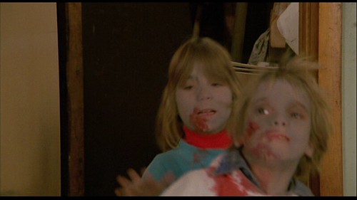
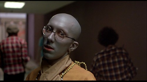
It’s also worth noting that ‘Dawn of the Dead’ Zombies were a light powdery blue-grey, not green:
Why can’t the blue-grey Zombies get any respect? The ZRC cares about all the Differently Animated, regardless of skin coloration. We’d like the rest of the world to acknowledge the plight of the Blue-Grey Zombie just as much as the Green Zombie, the Greyish Zombie, the Mostly Flesh-Toned Zombie.
We’re very inclusive here.
So in the end we have to rate this print a firm Anti-Zombie, for downplaying the plight of Zombies in the name of pop art and humor, while pushing outmoded, yet strangely anachronistic, stereotypes about the Differently Animated:


They’re also rather incorrect in their very product description. The Whimsy Print recalls the general 50s shift towards more modern, stylized designs and limited animation, at UPA (especially Gerald McBoingBoing or Rooty Toot Toot), Gene Deitch’s work at Terrytoons, in commercials, to some extent in early TV product like Ruff and Reddy, though these zombies really remind me of Deitch’s Sidney the Elephant: http://www.matsune.com/dvd/s/SIDNEY-dvd.jpg
Now, also to be fair, Disney briefly jumped on the bandwagon, mostly through Ward Kimball in a few TV segments and his shorts “Melody” and “Toot, Whistle Plunk and Boom” and Jack Kinney’s “Pigs is Pigs,” and artists Tom Oreb and Mary Blair *at* Disney used elements of this in their production drawings which were almost always compromised before the screen (and Oreb would leave for other pastures).
http://www.youtube.com/watch?v=GYXlF3sa9xs
But in general, show this to anyone knowledgeable about animation and they won’t think “Disney-esque.” They’ll say “50′s-esque,” “UPA-ish,” “Deitch-like,” or point out Jay Ward’s Quisp and Quake ads:
http://www.youtube.com/watch?v=Q-sTnm_aPBY
A lot of blather just to note that, as usual, merchandise which is wrong idealogically is also wrong historically. (That said, color palate aside, the aesthetic is not displeasing and, if only the zombies were smiling or at least with actual *variance* in expression and not just blank mouth-gaping things, it could have worked.) Mayhap (mayhaps? mayhem!) Mr. Perrillo will consider that in his next print, since he certainly doesn’t lack talent, merely full comprehension of the plight of the zombie. Ironically it’s much the same attitude which resulted in some of the worst racial depictions in the classic 1930s and 1940s cartoon shorts.
Yes, I thought about asking you to weigh in, since the iconography didn’t match my own conception of Disney style either.
Naturally you provided precisely the encyclopedic knowledge required.
I grabbed the description from a review on FearNet; the actual artists’ etsy page is pretty sparse on editorial content; I don’t think the print is for sale any longer.